Monday, August 22, 2011

Isla's reading nook.

Unfortunately, we had another family tragedy and are headed to Fairhope, AL. for a week. Since I will be gone, here is a little sneak peek until next week:


So our little one's room is a true labor of love for me. I have put so much thought into what she loves and would inspire her. A few days ago we made those pink tulle pom poms and created this little reading nook out of her old crib. She just loves it and is so proud. We have all been sharing one room since she was born and are finally separating into two. For now we are just moving into the office, as our bedrooms to be look like this:


As exciting as her big girl room is, it's a bit emotional for all of us, so we want to make her room uniquely her. Matt is working on a bed inspired by this one via Milk Magazine:

He is really talented, and Isla has some specific requests, so I can't wait to see how it turns out!
I'll do the full toddler room post when the room is completed.
Should be back in the swing of things the week after next.


Friday, August 19, 2011

to be continued...

Even though the house isn't anywhere near finished (the living room addition is 95% done construction wise). I've decided to post a few progress shots to show you where we are headed and give you an idea of the space I'm working with. So, keep in mind most of the house is not decorated, and I'm an awful photographer, seriously awful!

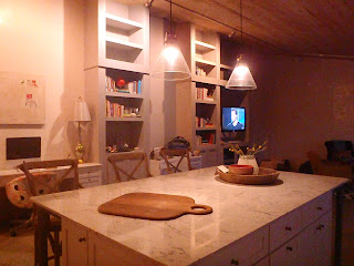
The kitchen is nearly finished, we just have to install the backsplash and a very little bit of cabinetry detail above the fridge as well as open shelving flanking the vent hood.
FYI the Marble is Bianco Venatino, polished.

This is the south wall, we still have to install the woodburning stove where those 2 leftover cabinets and the pile of construction hodge-podge is stored.
Living room area is the north west corner of the house which I haven't even attempted to decorate at this point. The list is too long to describe in this post. For you design geeks out there I'll be doing a whole seperate post on this.
Sink is from Vintage Tub and Bath and all the appliances we bought scratch and dent through Elite Appliances.
Lights are from Anthropologie.

Restoration Hardware counter stools.

I adore our stove, our kitchen in general. I fell so blessed to walk into the space every day! We are putting open shelving all the way to the ceiling on both sides of the vent hood.

This lamp was a local thrift store find along with the little sail boat, and the porcelain storage containers were a gift years ago from my best friend.

Again, book ends were a thrift store find that my husband picked up along with the brass whale paper weight, and the other trinkets and books have been collected over the years while traveling. The hand blown glass vase was a gift from my dear friend and owner of Metallo Gallery, Cassidy.
I have to say I LOVE our kitchen desk! The painting above was given to me for my birthday by the very talented Nigel Conway.

I'll be posting the play room, our daughters room and the 1/2 bath next week, as well as the progression of the bedroom addition we are in the middle of building.

I would love to hear your opinnions, suggestions or anything else you have to say.


Wednesday, August 17, 2011

Kid and Parent Bathrooms

pic. via remodelista.


First, sorry for the break. I had a family emergency and was away for the past 4 weeks. With that said I'm getting back into routine and in a few weeks I'll be posting the kitchen and living room outcomes! So stay tuned...

We just started designing both the kids and parent (hate using the word master) bathrooms. So I've been sorting through hundreds of inspiration photos sourced from various blogs. The challenge for me (as with the rest of the house) is balancing our current likes with that which we will grow into on a major budget. With bathrooms (and kitchens) it can get out of hand so fast. I don't want it to be too trendy but I also don't want it to be too elegant (which is not us at all). So, something to grow into is the idea..

Let me know your thoughts, and I would love to see any renovations your working on!


The above vanity is on major clearance at Restoration Hardware for 24 more hrs FYI.

This is one of my fave bathroom remodels featured on Design Sponge. Above and below.

Too much Marble for me, but pretty. I'm really liking those thick sinks.

My husband is an insanely talented craftsman with an impeccable artistic eye, so I'm toying around with the idea of something like this for the kids bath, but a single version. Not quite as thick and more like the first pic posted via remodelista.


This wooden tub ain't happenin' but I just think it so beautiful.

I love the look of claw foot tubs, and it's a possibility for our bath room which will have a separate shower stall, but for the kids bath we are doing a drop in tub with a shower. There will probably be a concrete surround, and in that case we need some pop of color to kid it up, I'm loving this orange.
via popham design.


This is such a unique layout and beautifully executed.

CUUUUUUTE!
I really like the idea of using art lighting above the mirrors.

Transport me please. I like the use of wood and concrete.

This is really nice and doable with a talented husband and a budget.

WHAT WOULD YOU DO?